BeYourLight
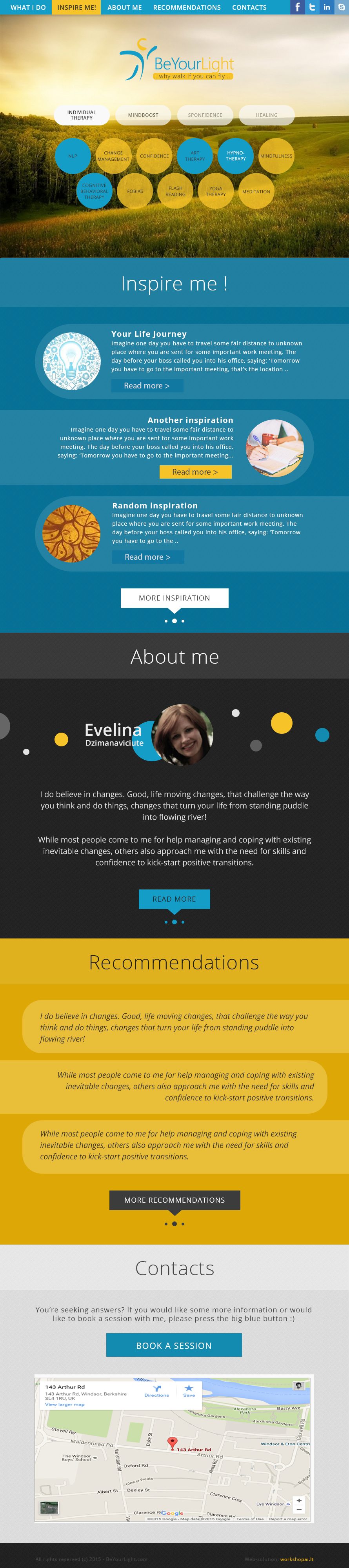
A long-form site for a UK wellbeing brand, where the scroll itself had to do the persuading.
The whole proposition lived on one long page — no navigation to hide behind, no second chance if someone stopped reading. That makes rhythm the main design tool: each section has to answer the question the previous one raised, and the eye has to keep finding a reason to continue.
Soft palette, generous space, one idea per screen. The pace slows down where the reader is meant to think and tightens where they are meant to act.
The brand has since moved on to a coaching platform, so the live site is no longer this work — the screenshot is what it was.